James Gin
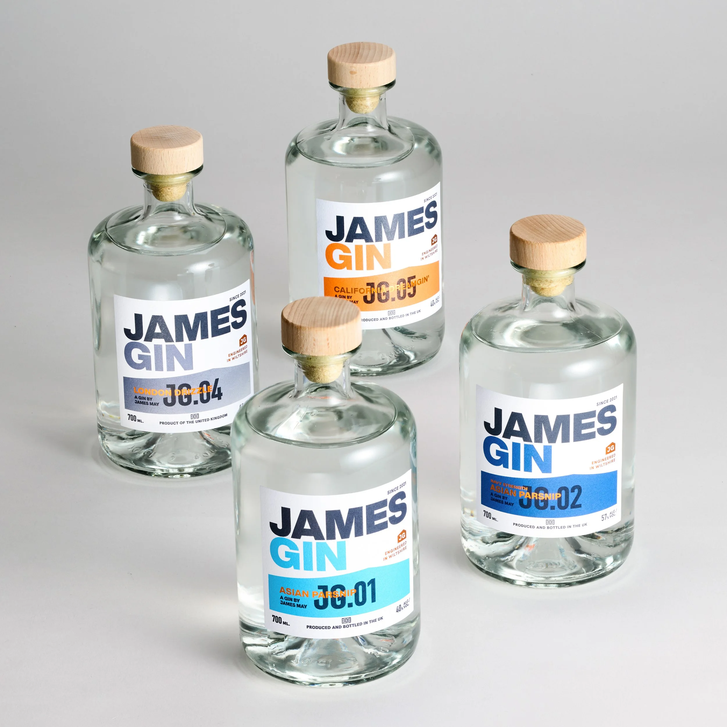
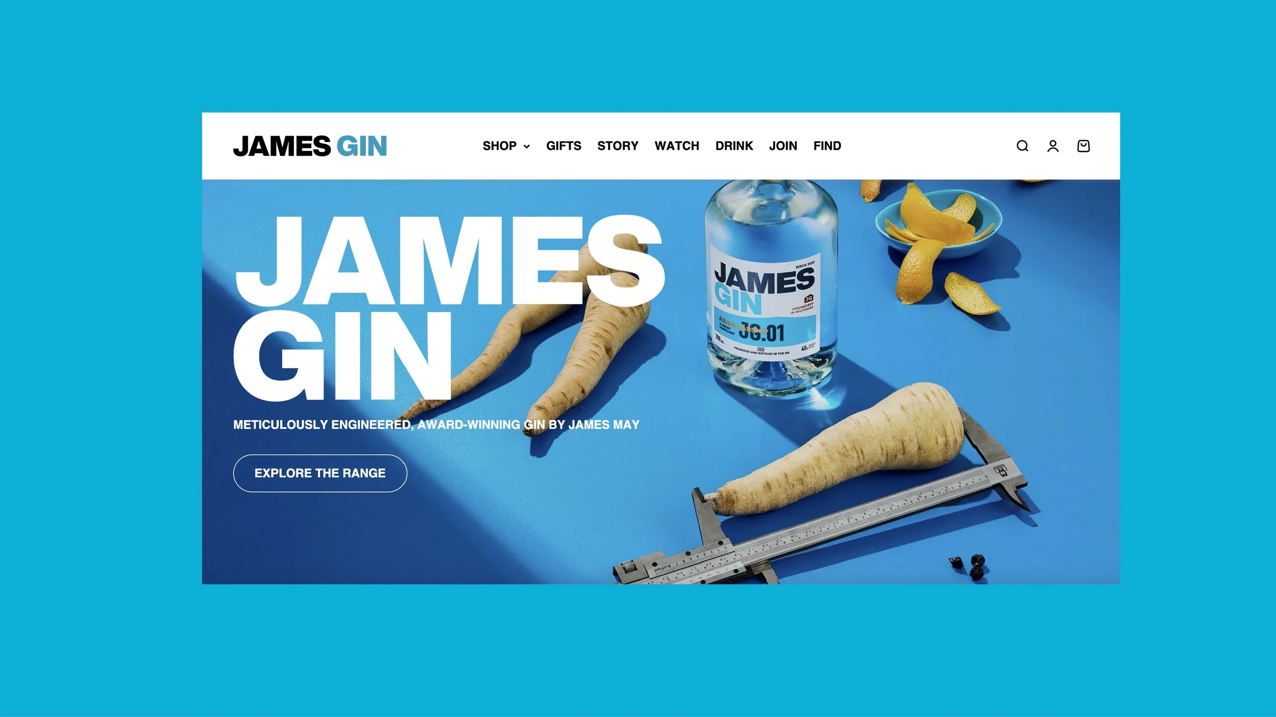
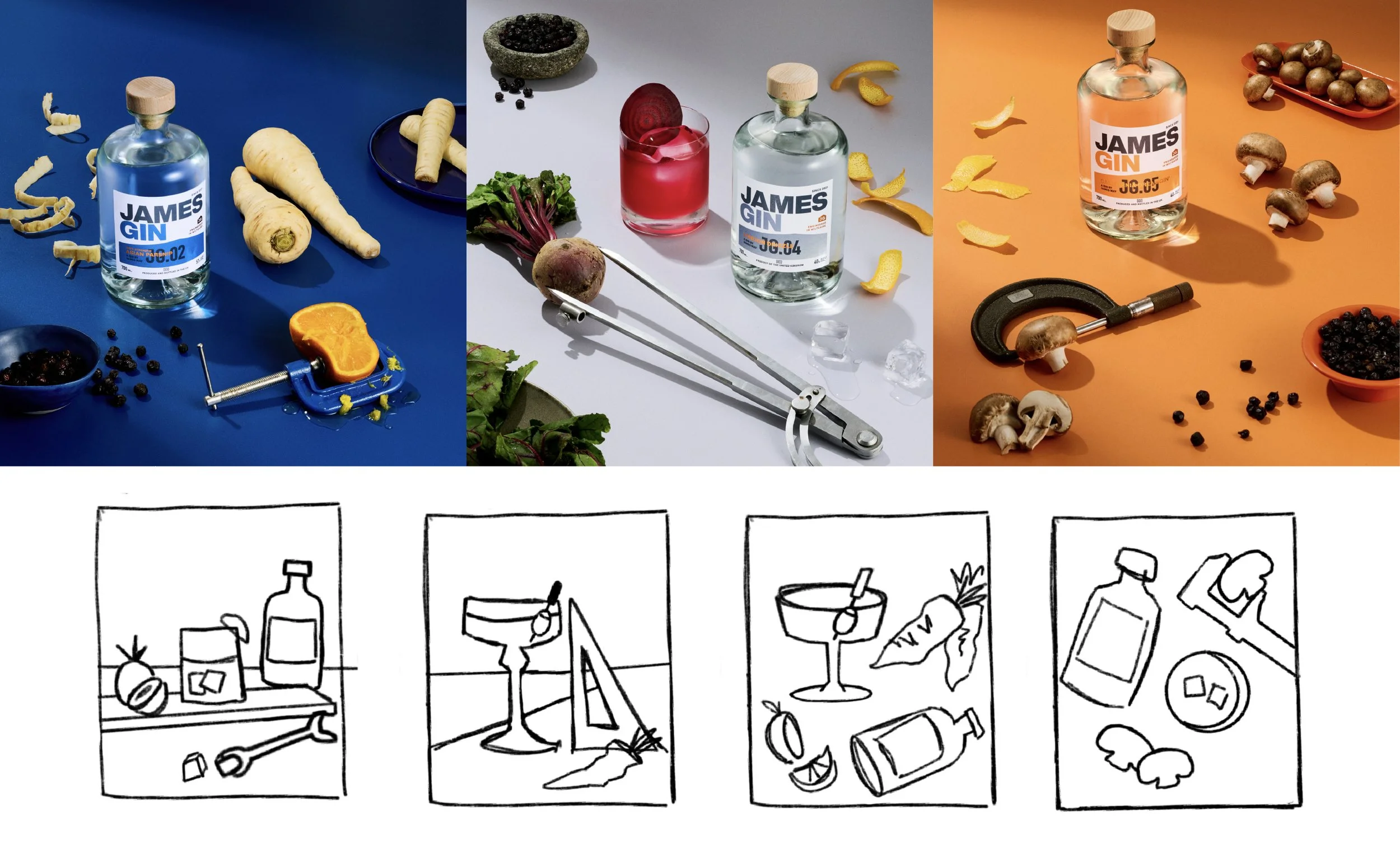
The rebrand for James Gin was driven by the brand’s unique personality: a playful spirit balanced with engineered precision. Inspired by James May’s character, the new identity is bold, confident, and vibrant.
A key feature of the label is the abstract, shed-shaped block of colour, an understated yet meaningful nod to the brand’s humble beginnings in a garden shed, where the first experimental batches were distilled. This detail grounds the modern aesthetic in the brand’s authentic story, creating a design that is both striking and full of character.
Client: James May
Branding / Web design / Illustration / Visual Merchandising / Art Direction